Phone: +27 11 432 0969

Tex’n Chicken – Brand and packaging


shape
shape
About the project

Packaging with
an appetite

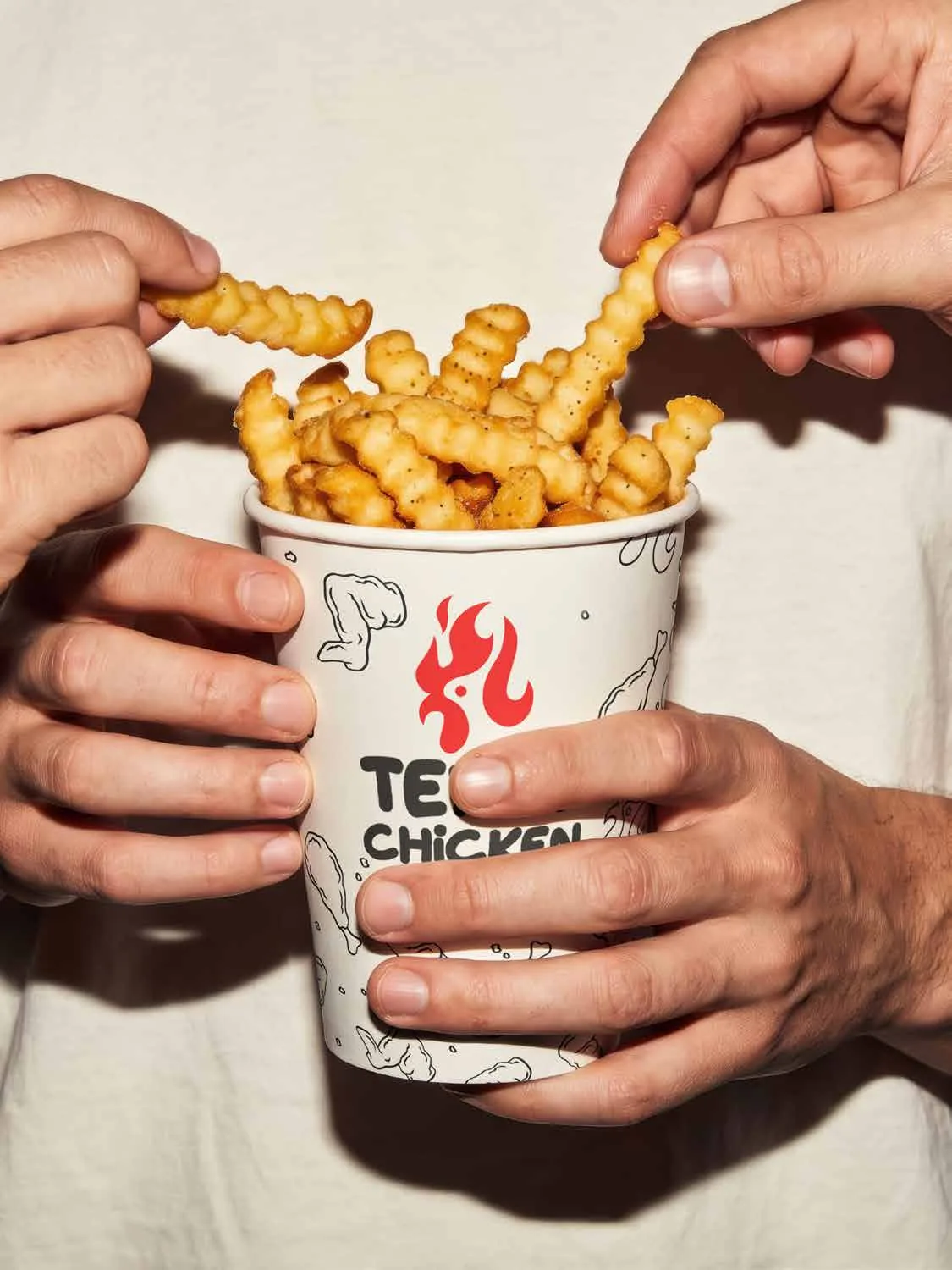
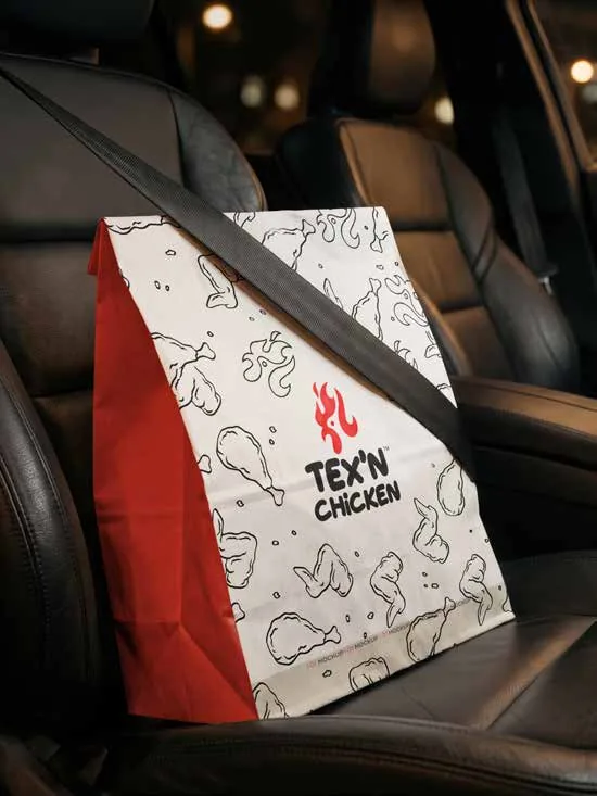
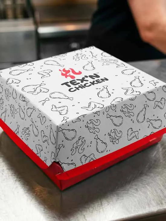
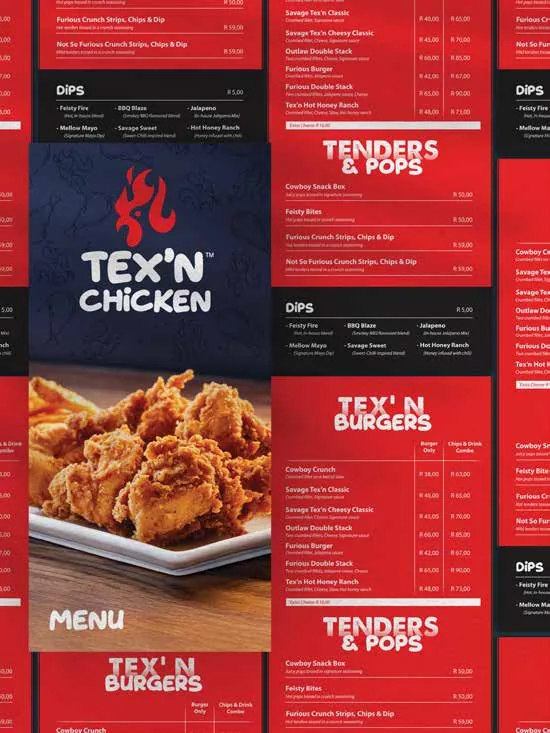
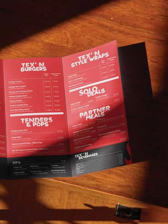
Tex’n Chicken needed packaging as bold as its flavours. We created a playful identity with a flame-and-chicken mark and a hand-drawn pattern, then carried it across chip cups, burger boxes, takeaway bags and a full menu system in fire-engine red.

The result: every order leaves the counter as advertising.

image

Good packaging gets eaten with the eyes first.
Client

Tex’n Chicken

Services

Brand identity, packaging, menu design

Sector

Quick-service restaurant

Got a brief like this? We’ll make it unmissable.

Next project

MSAP Mluthano – Brand identity

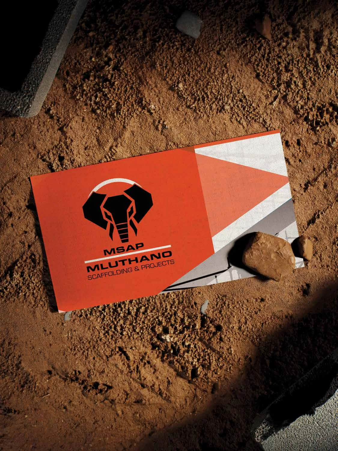
Scaffolding is all about structure, so the brand needed some.
image

Brand identity